When Autoship Fails to Be Automatic: Task Analysis Case Study
TL;DR A Task Analysis mapping my journey to modify an autoship order proves so challenging that the only successful way to complete the process is to cancel the original order and create a brand new one.
I had what I thought was a simple idea: to add an item to my cat’s ongoing food order. How hard could this be?

Figure 1. Image that appears at the top of the email from PetValue, alerting me to pending autoshipment
PetValue sent an email alerting me that the shipment was about to be placed in a few days (Figure 1). I logged in to modify the order.

Figure 2. Modify Your Order button appearing on email alert
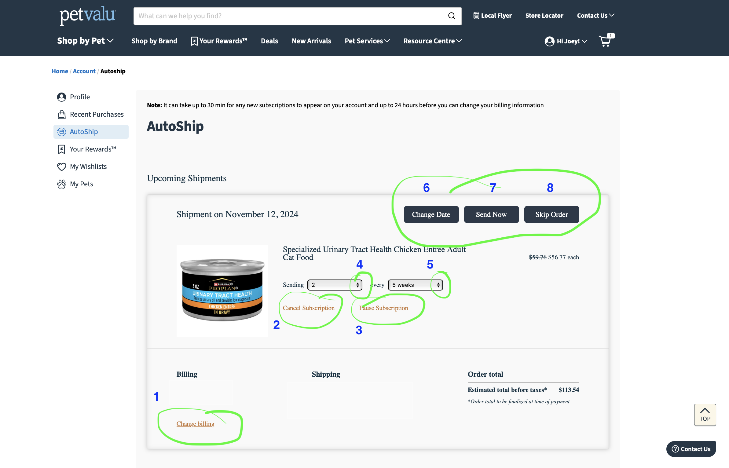
Figure 3. The eight buttons available in the Autoship feature
Once on the Modify Your Order page, nested under Profile -> Autoship, 8 buttons appear: 1)Change Billing, 2) Cancel Subscription, 3)Pause Subscription, 4) Sending (quantity), 5) Every (frequency), 6) Change Date, 7) Send Now, and 8) Skip Order (Figure 3). I hunted around for an additional option, which would allow me to add Salmon’s (that’s my cat’s name 🐈) favourite treats. The problem: These treats don’t cost enough to qualify for free shipping on their own, so including them in this order is essential to a happy user exerience and a successful customer journey. Where’s the option to Add Additional Items to This Autoship Order?
But no such button exists. A last resort, I clicked Cancel Subscription, and assumed the only option was to start over with both items in a single cart with the same order frequency (Figure 4).
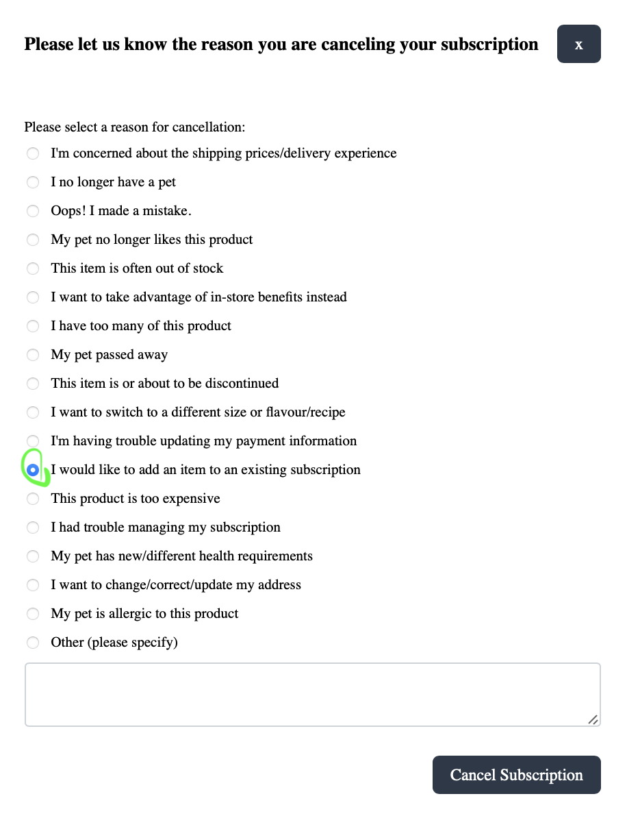
Figure 4. List of reasons to cancel an autoship subscription
I was pleasantly surprised to see that they were collecting reasons for cancelling because this indicates an interest in gathering data on their customers. Which might mean an ongoing interest in feature improvement and overall better user experiences. But then I read the list and my pleasant surprise turned into exasperation because I saw this phrase:
“I would like to add an item to an existing subscription.”
So they already know about this horrible UI (user interaction) flaw? Knowing about a flaw that leads to customer frustration is akin to hating hating the pants your wearing and wearing them anyway, even though you have other options. Actually not entirely similar cases, as engineering fixes are far more complicated than changing pants (device requirements or browser limitations to only name two). Regardless, and I’m choosing to be optimistic here, being aware of the problem while continuing to collect data on said problem may indicate a desire to move the issue higher on the UX debt severity scale, should people keep telling PetValue this is a problem.
So I selected “I would like to add an item to an existing subscription” and clicked Cancel Subscription.
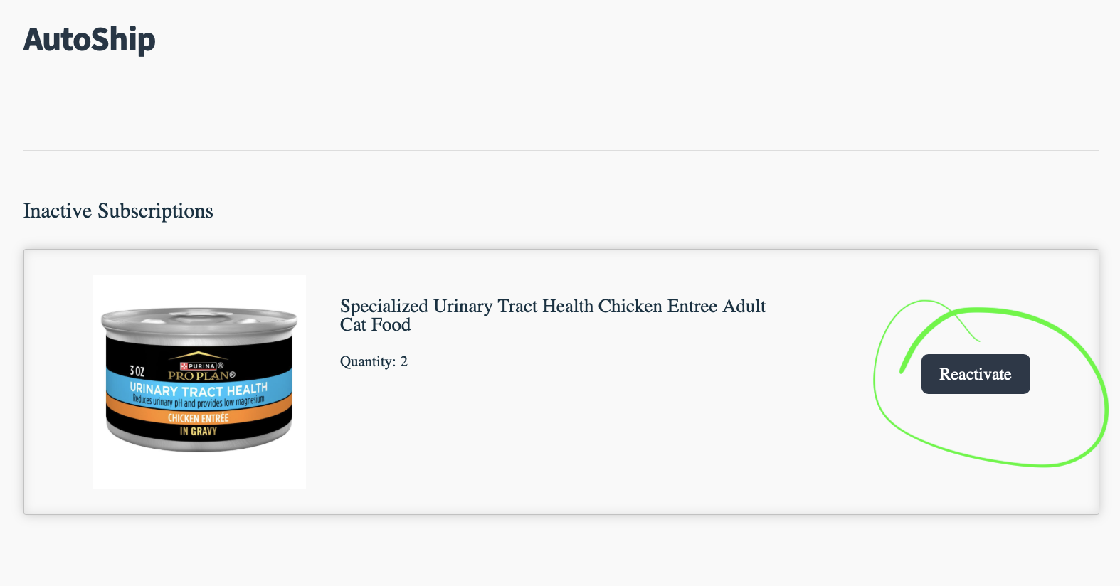
Figure 5. Autoship Profile indicating my Inactive Subscription with button to Reactivate
Once I cancelled the subscription, my Autoship Profile read as “Inactive Subscription” with CTA (call-to-action) to Reactivate (Figure 5). Upon clicking, the Reactivate Subscription popped up (Figure 6) but all this did was reroute me back to the original issue, of not being able to add any additional items to this original Autoship order (I’ll spare you the inane fuss of seeing this happen all over again and circumvent falling down this rabbit hole). I did the only logical step: selecting the “X” and started over.
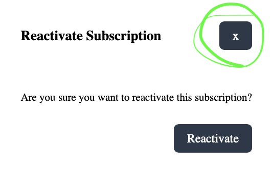
Figure 6. Reactivate Subscription call-to-action pop up
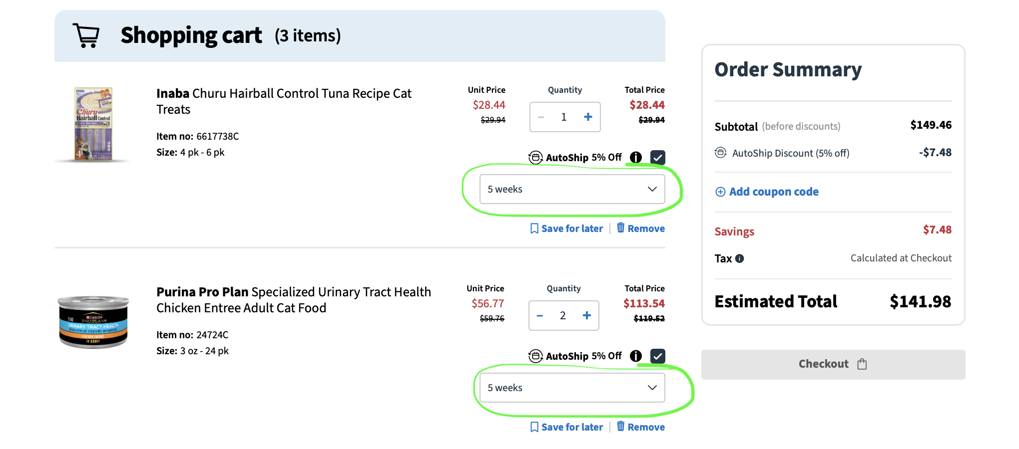
Figure 7. Shopping cart with two items newly added, set for same delivery frequency
Smiling at the bad UX yet crossing my fingers this step (Figure 7) leads to roundabout but simple success, I added the two items I wanted simultaniously delivered and selected the frequency for each at every 5 weeks. Well look at that - victory!
But wait! We, dear interested reader of task analysis, have one more thing to explare.
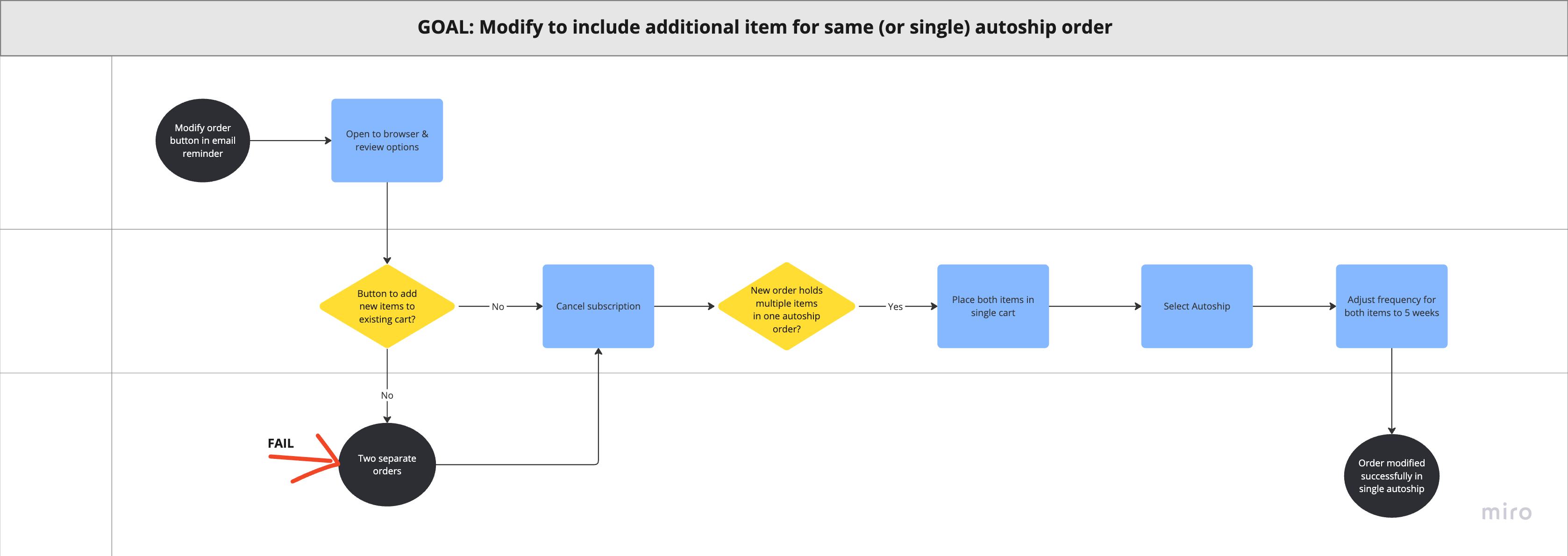
Now for the Hierarchical Task Analysis diagram illustrating this user experience journey:
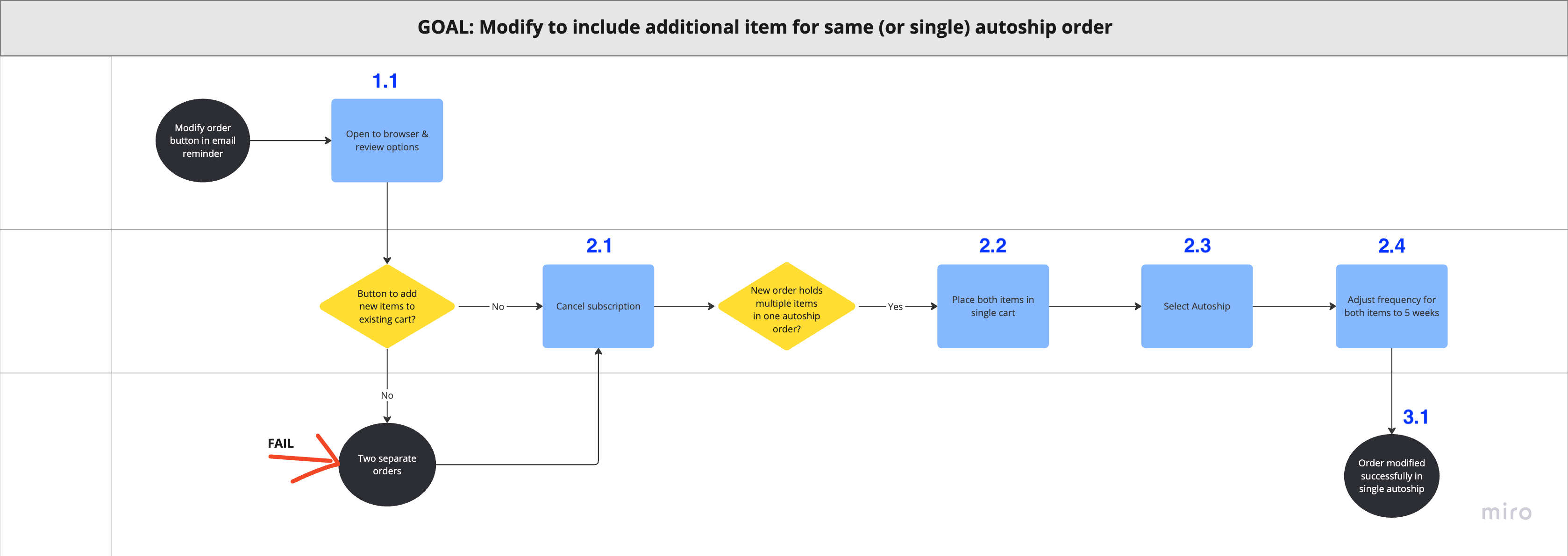
Figure 8. Hierarchical Task Analysis diagram illustrating the three stages to achieve goal of modified order for single autoship with multiple items
At worst, a frustrating experience leads to customer churn. Too many tasks to complete a process - especially when the rationale for them is vague or unnecessary to the user - create too many “operations,” to use a Human Factors term. Good user experiences and functional interaction design lowers churn. And when too many of your customers leave, your product fails.
My Hierarchical Task Analysis (HTA) (Figure 8) shows 3 major tasks (Steps 1, 2, 3), and their subtasks (like 2.1, 2.2, onward). Some subtasks aren’t featured here, for ease, as they are not necessary to achieve the overall goal of the process (like with the extra popups and buttons to select why cancellation was occuring, and the attemps to Reactivate original subscription beginning the original problem all over again). Instead, I focused on the Cancel Subscription and rebuilding a New Autoship process.
Good UX here (Figure 8) would eliminate 3 to 4 steps (or, more true to the actual trial-and-error experience, around 7 or 8, with the addional subtasks I mentioned in the paragraph above). Good UX user flow would look like this:
-> Button to add items to existing Autoship order
-> Add item(s)
-> Save/Order
Failure to provide a simpler user flow not only limits usability, but also decreases (if not eliminates) the potential of higher conversation rates for additional purchases. As a customer, if you don’t make it easy for me to buy more of your stuff, I might look elsewhere for a single place to make my purchase instead.