I Built a Website in 21 Days: Documenting My Design, Accessibility, and Programming Language Journey
#say no to no-code
TL;DR Connecting experience design, basic programming for web development, and accessibility audits, this piece does two things: 1) it shows how I learned to build my own website – with HTML, CSS, and Markdown shorthand – illustrating my comfort and adaptability with learning new technologies, and 2) my documentation procedures for coaching, onboarding, and operationalizing.
Contents
I chose to leave Wix – a template enabled tool for website building – and design my own site. Besides the myriad reasons not to use Wix, my original use case was rendered moot: they removed an element within part of the tooling, breaking the way I had displayed my portfolio. Suddenly my button clicks went nowhere. I spent two full days reading FAQs and watching tutorials only to wind up discovering three different ways to achieve the very same result across all the features, none of which enabled the necessary functionality.
About to pull my hair out, perhaps literally, a friend asked a simple question: “why don’t you build your own site?”
After laughing like a lunatic – he wasn’t joking – I listened to what he said next: “I’m not a web developer but I built my own site. There’s open-sourced tools out there, using simple coding, and I can point you in the right direction. You’ll have to do it yourself. It’s a lot of work. But once it’s done, no one else can alter your site because you’ll own it. Forever.”

Figure 0. Confirmation of Wix plan cancelation
Hope emerged in my heart – I felt like Bastian from The NeverEnding Story, soaring powerfully through the sky on the back of Falkor, The Luck Dragon – The moment I hit key strokes, and saw my site begin to build, a fire blazed in my mind.
Process
These are the steps I took to determine what, and how, to build my site:
- Define site requirements, content strategy, and information architecture
- Choose a theme from an open-sourced repo, ie: with Hugo
- Buy a domain, ie: with NameCheap
- Register the domain, ie: with Netlify
- Create a Github account
- Sync the Github to the theme with your computer’s Terminal
- Use a code editor like Visual Studio Code (for building and debugging) to migrate content
- Accessibility testing with PageSpeed Insights or other
- Push to Github with your Terminal
- Keep building, steps 7 onward
This piece will focus on steps 6, 7, 8, and 9.
Terminals
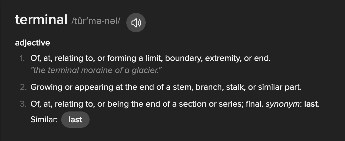
Figure 1. Definition of the word “terminal”
Word play is one of my favourite activities. To have the most fun, you have to understand all the different meanings a single word can have, from colloquial use to varied historical contexts. “Terminal,” in the case of web development, is a computer’s input/output device for data and commands. It’s where you tell your computer to do things: the terminal provides boundaries or limits. But in knowing what these are and how they work, you can stem or branch off from here, making or growing something.
Building
Setting up the Code Base - Step 6
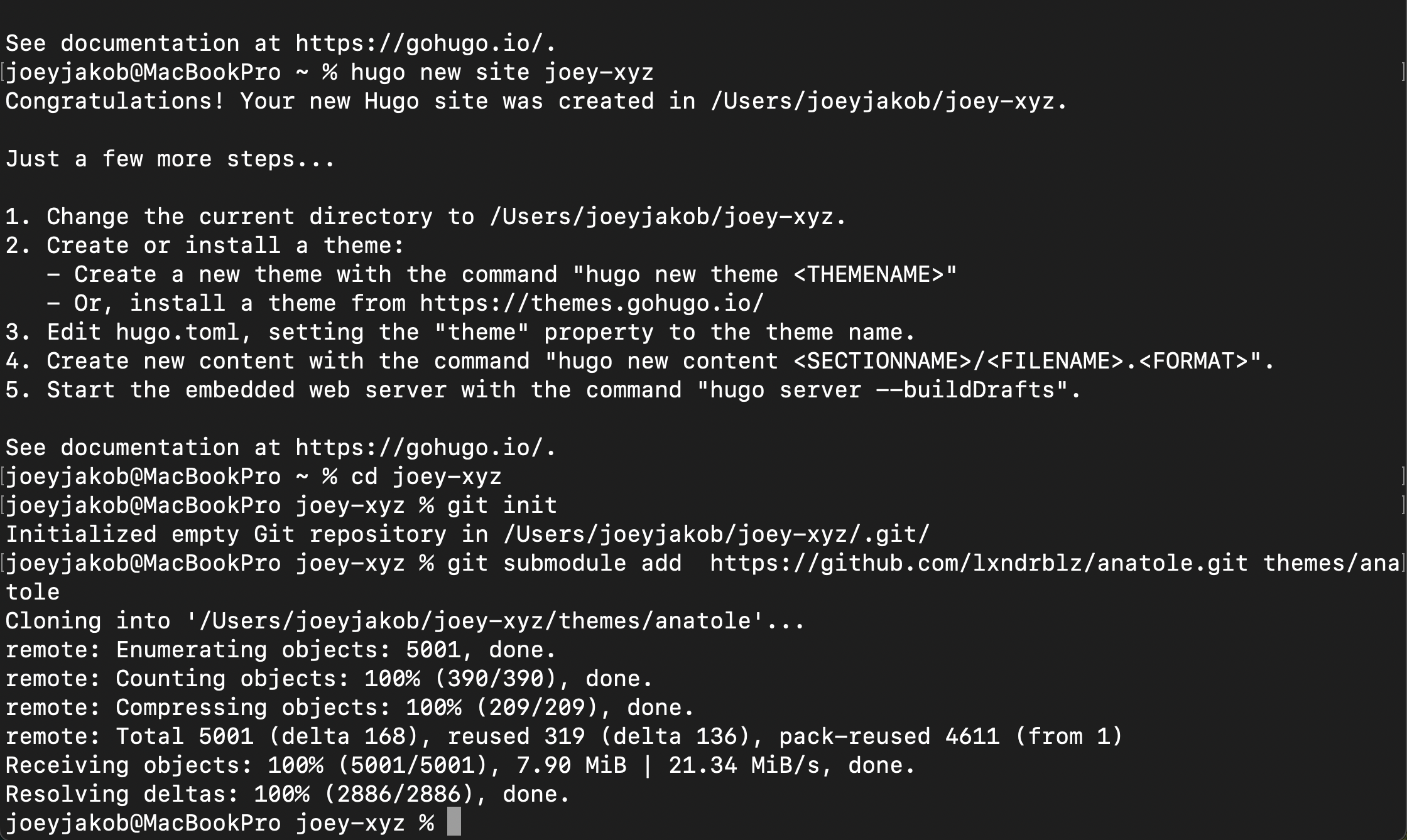
Figure 2. Sync Github to Hugo Anatole theme code base
Figure 2 shows my computer’s terminal, and the inputs to begin my site development using Hugo, an open-sourced framework to build sites. I chose the Anatole theme from the hundreds available for its features (shout out to the site developer Alex Bilz:
- Minimal two-column pages
- Blog capabilities
- Portfolio capabilities
- Dark mode enabled
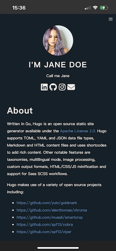
Figure 3. Mobile Anatole theme, About
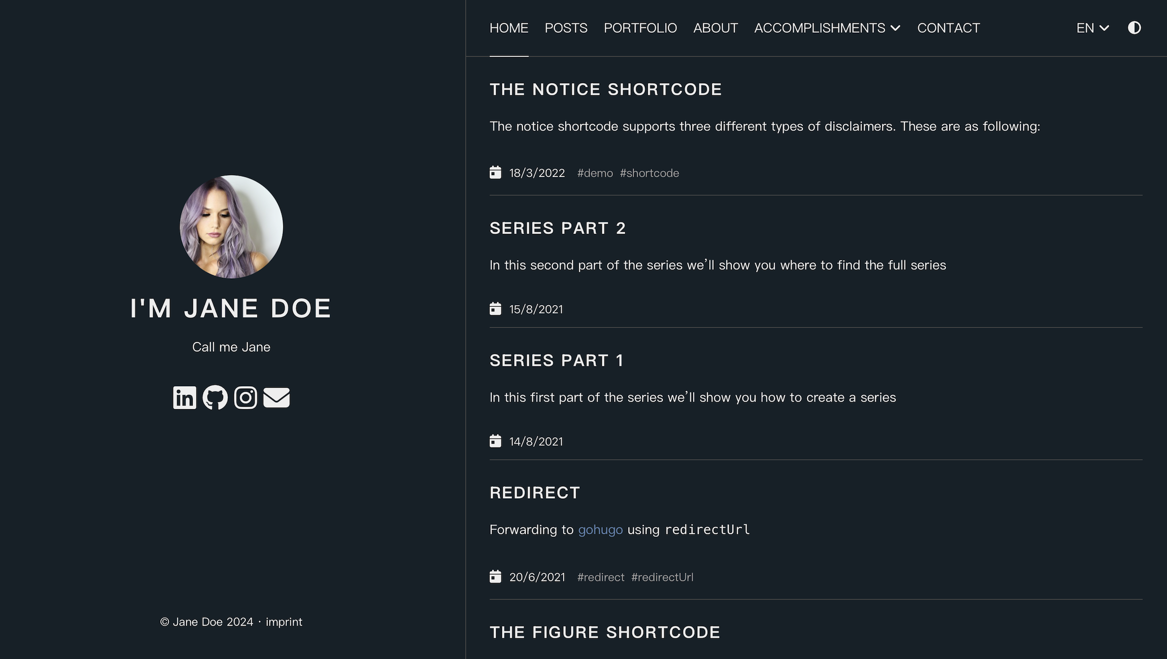
Figure 4. Desktop Anatole theme, Home
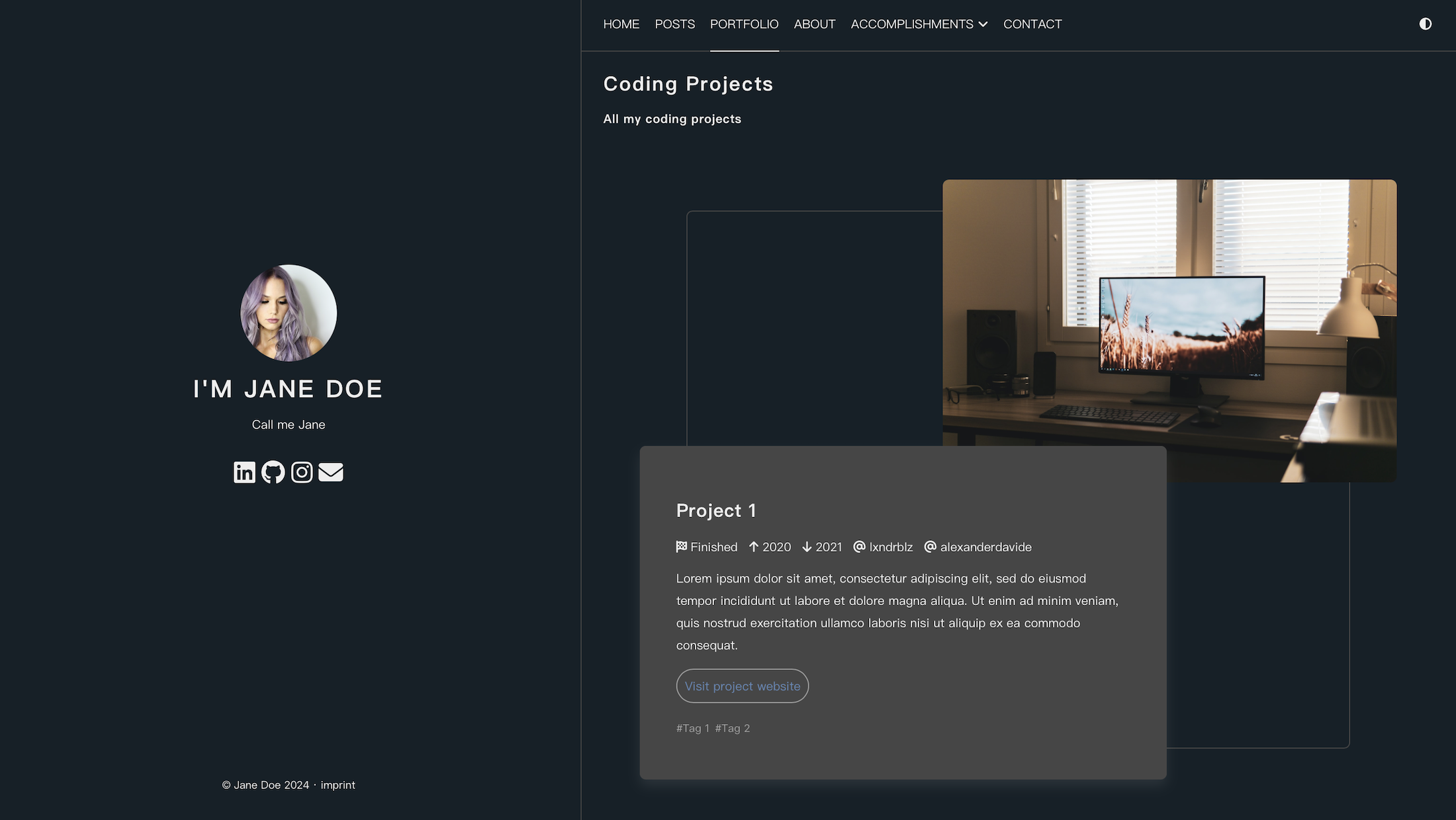
Figure 5. Desktop Anatole theme, Portfolio
Illustrated in the above About, Home, and Portfolio screengrabs, here’s the link to the full original sample site in case you want to tour it yourself. And since you’re on my site, can you spot the differences from this original?
Development
Commanding the Dev Environment (Step 7)
Within Visual Studio Code there is another Terminal where you insert commands to build website elements. You can also see drafts prior to publishing (or, as I’ve learned to say, to “Git-Commit,” which is boatloads of fun to use on your Engineering friends when asking them to Git-Commit to, let’s say, your dinner plans).
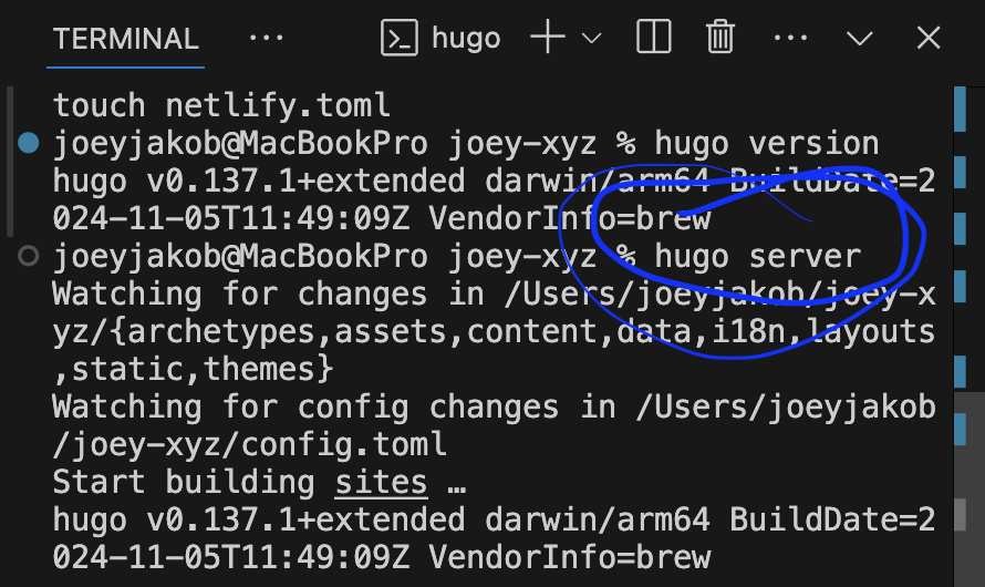
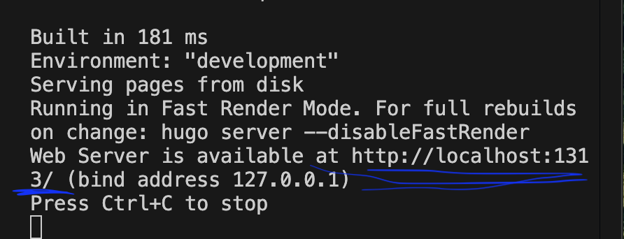
Figure 6 & 7. Connecting to Hugo server and launching the //localhost test environment
To open the dev environment – ie: testing site in a browser – type in the Visual Studio Code terminal:
hugo server
Doing so tells you where to view the live test environment – ie: what appears as a web address, phrased as:
localhost
This is as great time to say: perfectly typed commands are essential. We aren’t even actually dealing in code yet, but even in the Terminal, every key stroke counts. An extra space you didn’t mean to type? It won’t run! A file name that isn’t exact? It won’t build! Incorrect directory command? Error messages that break your heart!
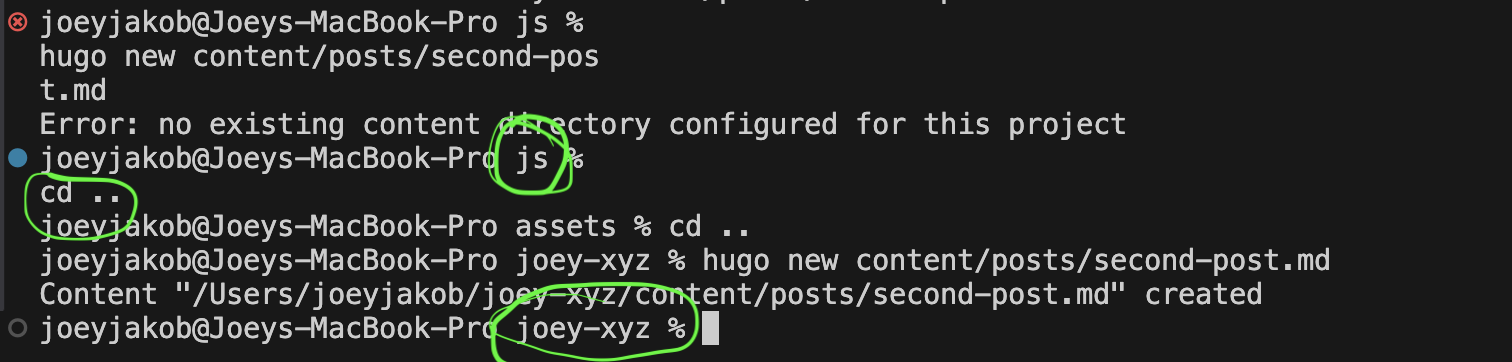
Figure 8. “cd[space].._” changes content directory back to root directory: joey-xyz (ie: github)
Figure 8 shows what happens if you attempt to make changes in an unintended directory. Here, I was trying to make a new blog post, and it needs a proper directory to link to. Let’s break down what happened.
An error occurred here:
«joeyjakob@joeys-macbook-pro js % hugo new content/posts/second-post.md».
Why? Because my Visual Studio Code Terminal was communicating with my macbook Terminal in JavaScript (“js”), when I wanted to communicate with “joey-xyz,” my Github. Confusion is ok here. Said another way, joey-xyz or my Github – the “root” directory – is the only directory we can work in to build my site.
You might also be wondering, this is how the command appears:
cd[space]..
joey-xyz
This is what I spoke of above, that every keystroke counts. The “cd [space] ..” command opens a new directory. In this case, I moved up the branch, from “js” (JavaScript), to “assets” (a subdirectory where CSS lives), to “joey-xyz” (my root directory, connected to Github). Commands are necessary to tell computers to do anything. In the process of learning, I find it helpful to take screengrabs and then annotate them with marker, as illustrated above, and name the image the purpose of this action.
We’re now in “joey-xyz” which means we can finally build out a new blog post directory with the command:
hugo new content/posts/second-post.md
Each / [slash] typed in terminal indicates where in the directory to build the corresponding action. In this case, we nest the “second-post” like this:
Content → Posts → Second-Post
We then follow this up with “.md,” as this indicates the use of Markdown, a formatting language. This is what it looks like:
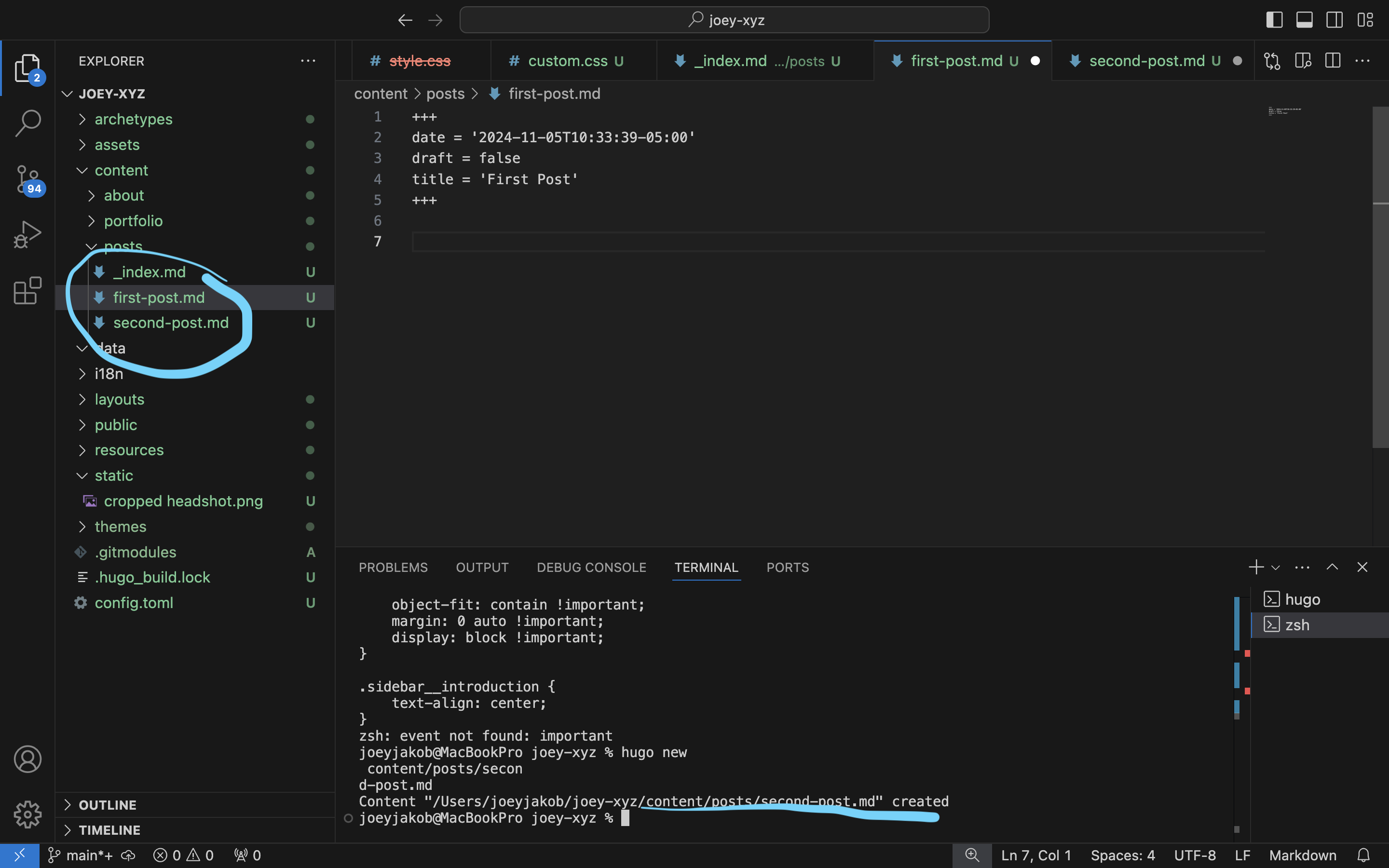
Figure 9. Creating additional blog posts
Error
Breaking the Dev Environment
A rite of passage is breaking the site: when the wrong code or the wrong Markdown commands are used.
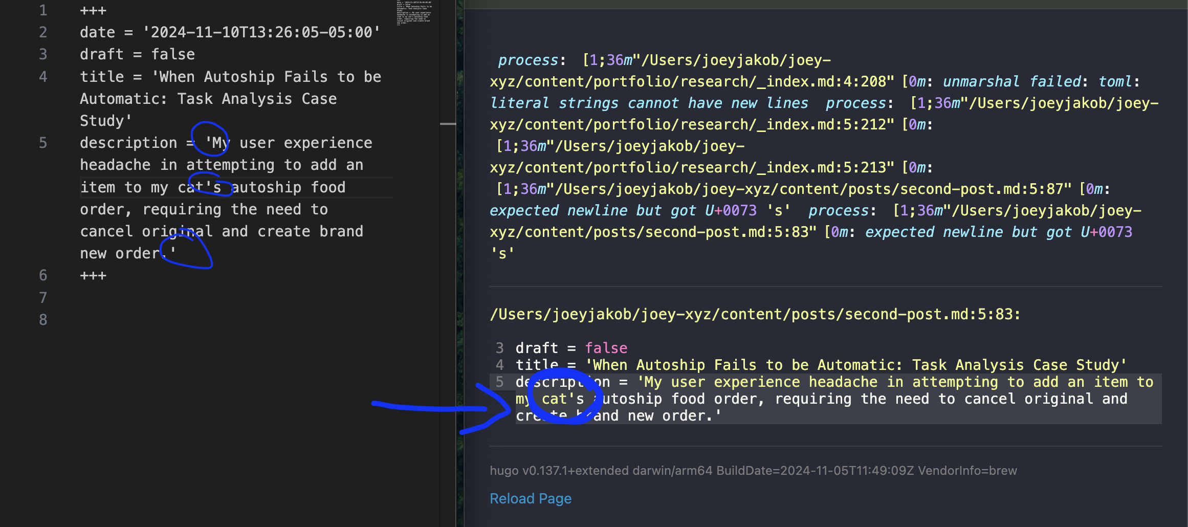
Figure 10. Fail. Broken code on line 5
The code used to build my site has specific parameters around using quotes. What broke here: I attempted to refer to my cat in the possessive – ie: “my cat’s“ – but my use of the apostrophe was read as a close-quote. The beauty of an error message, though, is that it tells you exactly where the problem occurs, in this case, line 5. The computer read the mistaken apostrophe for close-quote, meaning that the actual close-quote at the end the “Description” field, in effect, acted like an open-quote. And an open-quote requires a close-quote, silly! My solution was to rename the description without the need for a possessive apostrophe. Et voilà.
Another fun error: “Failed to unmarshal YAML”.
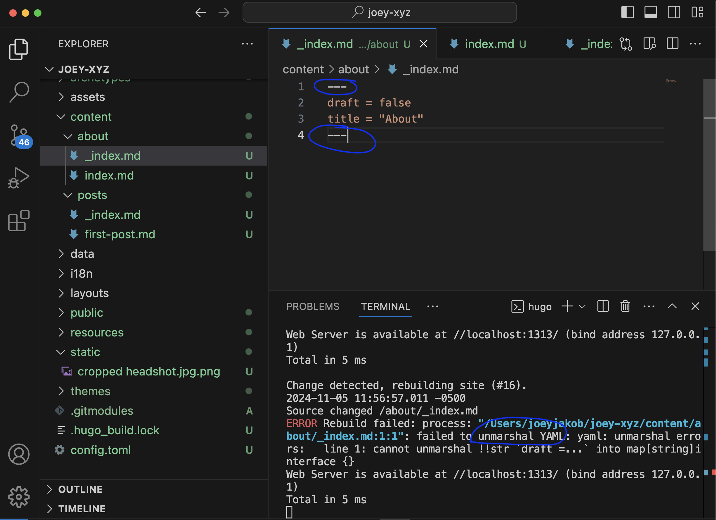
Figure 11. Failed to unmarshal YAML, Terminal communication
First, what the heck is a YAML? And what even is it to “unmarshal”? Welcome to the wonderful world of programming languages. YAML – or “YAML Ain’t Markup Language” or “Yet Another Markup Language” – is a human-readable data serialization language. We are human, and thus we should try to read it. So the YAML fail here resulted from the incorrect syntax. I originally had used:
- - -
This syntax broke the test site because any number of “-” equates a minus, effectively telling YAML to “strip” the line where this occurs. We can see this in the next shot, occuring on line 1 instead of the intended 2:
1 draft = false
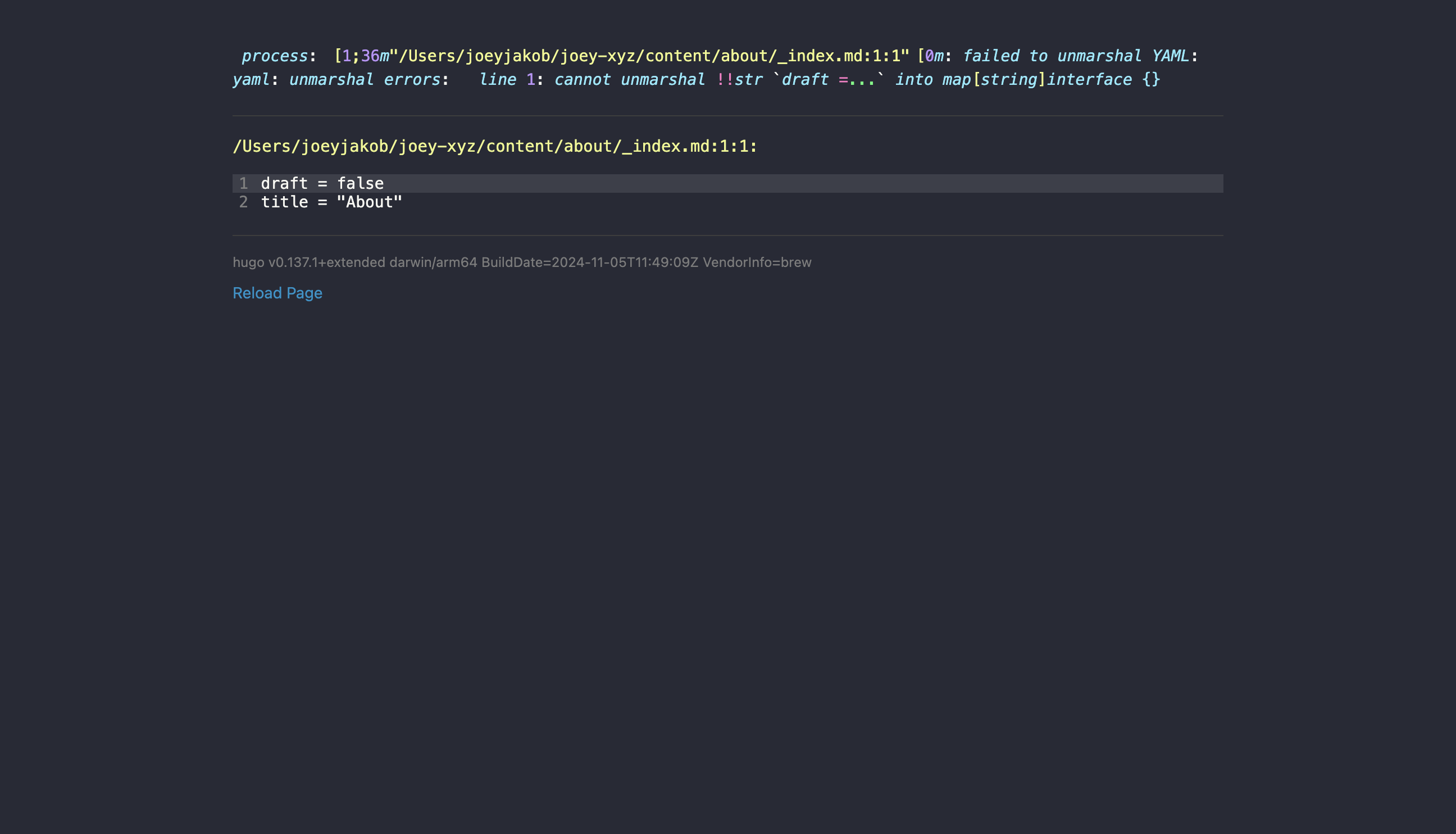
Figure 12. Failed to unmarshal YAML, test site broken due to unintended syntax: “- - -”
I had questions for the internets about YAML and it’s syntax. I saw that changing the
- - -
to
+ + +
would communicate to “keep the line feed,” which is a fancy way of saying: please read this line as a line.
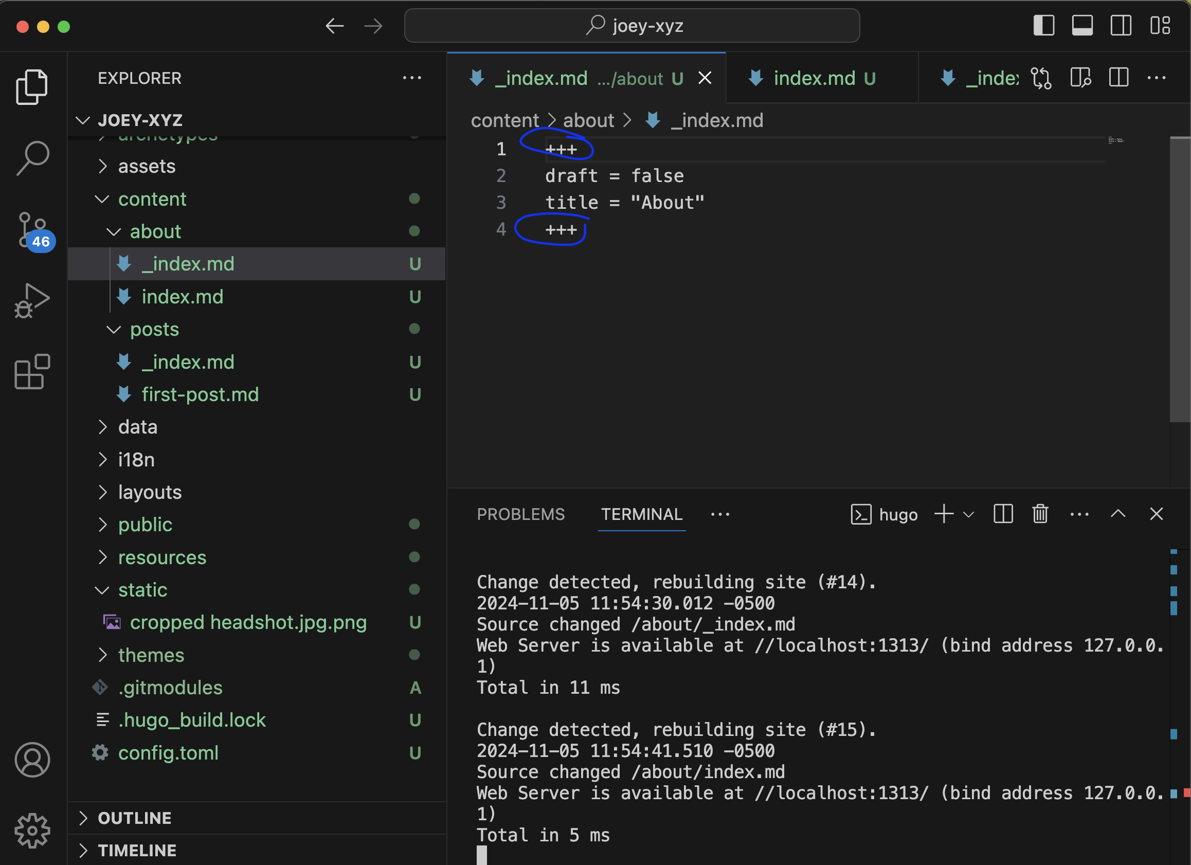
Figure 13. Unmarshal YAML with intended syntax: “+ + +”
And now that you know about YAML, it’s also important to not get too comfortable, because there’s so many more. Like TOML – “Tom’s Obvious Minimal Language” (programmers and engineers are indeed very funny). TOML’s purpose is to enable configuration with ease because of its minimal, obvious semantics (another joke?); it’s usable in a variety of programming languages, and allows for mapping to a hash table, like the one below:
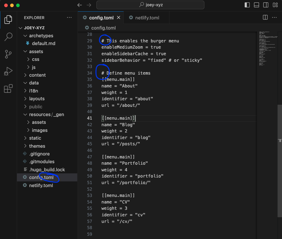
Figure 14. TOML configures via # [Hash] tables
As an example of the ease that TOML configuration allows: the ordering of burger menu items on a webpage. Originally my order had CV 4th, with Portfolio 3rd.
[[menu.main]]
name = "Portfolio"
weight = 3
identifier = "portfolio"
url = "/portfolio/"

[[menu.main]]
name = "CV"
weight = 4
identifier = "cv"
url = "/cv"
But this didn’t make sense to me; I opted instead for alphabetization. Changing this was simple – and honestly intuitive, because I figured it out without having to ask Google, Claude, or Perplexity. All it took was switching the “weight” numbers, Portfolio as 4 and CV as 3.
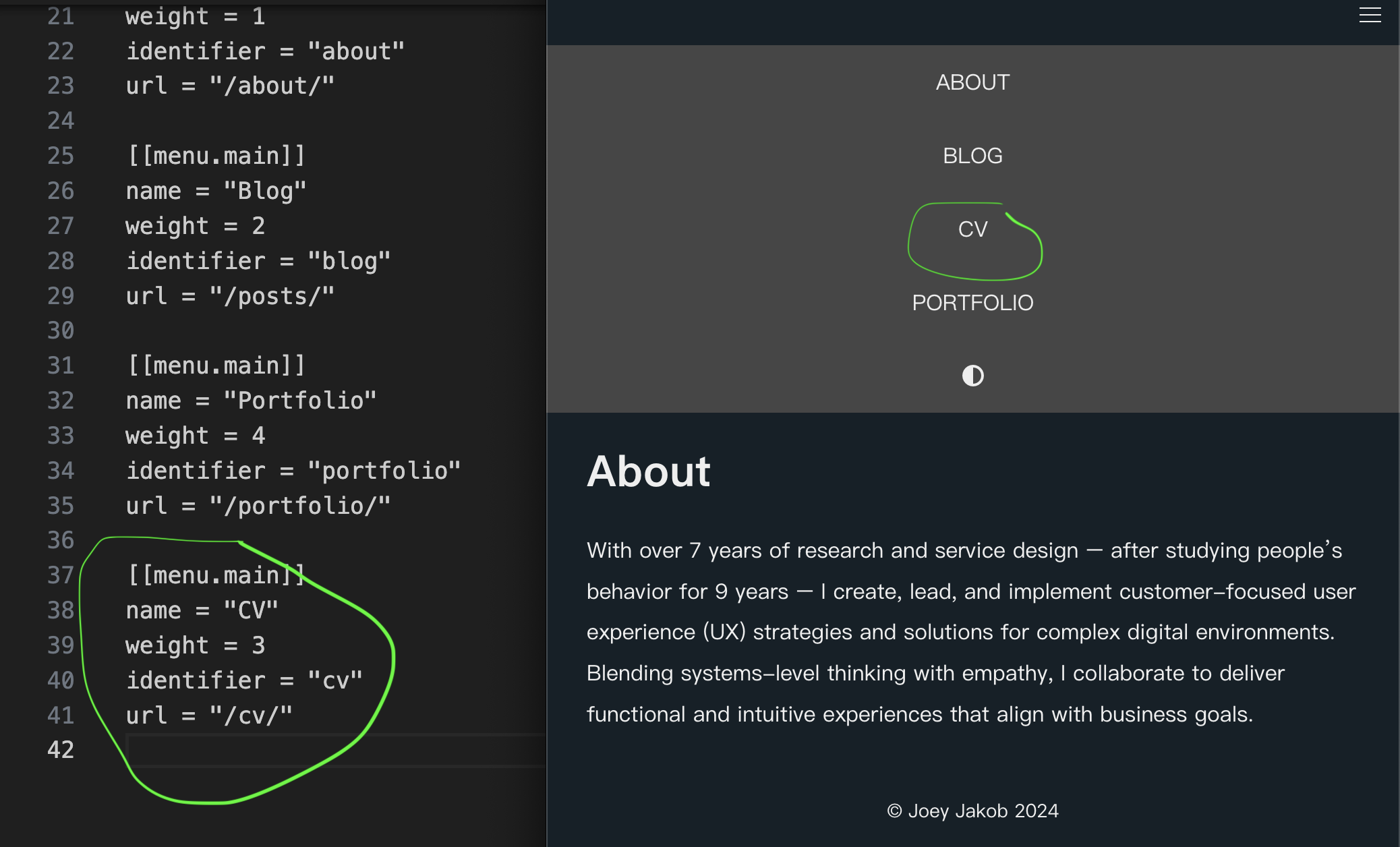
Figure 15. TOML weighted order, changing placement of CV to 3rd and Portfolio to 4th
TOML is so effective that, even though to the human eye it would appear Portfolio and CV are not sequentially placed, the language is the logic.
And suddenly the site was fixed; my heart was unbroken.
Accessibility
Using GenAI to Help Write Code: Finding Accessibility Issues (Step 8)
Since I’m not a web developer, nor a coder by craft, coding language takes effort. But we live in a time (for better or worse) where we can employ new GenAI technologies to achieve things beyond us. In this case, I wanted to ensure my site was accessible for those who use screen readers. So I asked Perplexity.ai to help me appraise the open-sourced code that came with the Anatole theme: “Can you tell me if this code is accessible for a11y users?” Perplexity first said the code was fine, but it didn’t directly tell me why, so I asked it again:

Figure 16. My question for Perplexity.ai: “Given my followup question on accessibility, do the instructions you provided need to be amended?”
Perplexity replied that, yes, amendments were needed, after thanking me for being thoughtful.
(Oh, and BTW, other GenAI tools should also be used. Perplexity is great for providing its sources, so you can check its work. Claude is often even better, since it’s the current leader for code work; I had used it for some code writing, but was too into it at that time to capture screenshots. The image in your mind’s eye: a furious, sweaty hacker, aka: a coder.)

Figure 17. Perplexity.ai answers: “Here are some amendments and additions to enhance the accessibility of the expandable content”
Perplexity spit out the code to be added to my «custom.css».
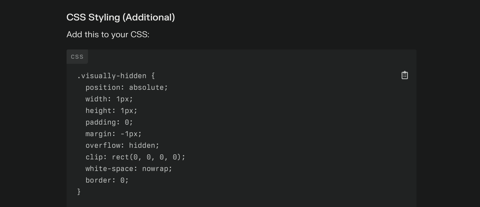
Figure 18. Perplexity-supplied CSS to incorporate visually-hidden elements for enhanced site accessibility
Perplexity then followed up with a description of what these additions created:

Figure 19. Accessibility additions: visually hidden elements, focus styles, and custom markers
I took a look at what my original CSS code included, and how it was different. Here’s it appeared as:
.visually-hidden {
    position: absolute;
    width: auto;
    height: auto;
    padding: 0;
    margin: -1px;
    overflow: hidden;
    clip: rect(0,0,0,0);
    white-space: nowrap;
    border: 0;
}
It made more sense now: specific to the code above, the width and height required adjsting. These accessibility tweaks via CSS code now enable:
- Visually hidden class for screen reader text (ie: elements are described, where appropriate, for screen reading)
- Focus styles for keyboard navigation (ie: signposts or markers on the site for those using single key-click navigation)
- Replacement of default markers with custom ones for better visual indication (ie: instead of “auto” height and width, we’ve replaced it with “1px”)
The added code to my custom.css now appears like this:
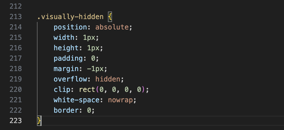
Figure 20. Visually-hidden code includes these features: position, width, height, padding, margin, overflow, clip, white-space, and border.
Using Page Speed Tests: Addressing Accessibility Issues
Even with these changes, there’s still more that can be done to ensure better accessibility. With each major change made to the site, running it through page speed tests check for: Performance (overall), Accessibility, Best Practices, and SEO. I’m particularly concerned about Accessibility and Performance (an indication of how easily the site loads across mobile and desktop platforms).
Page speed tests only run one page at a time, which means you have to provide the test platform with each of the pages individually. First, I ran the overall Posts/Feed page. Here’s the results:
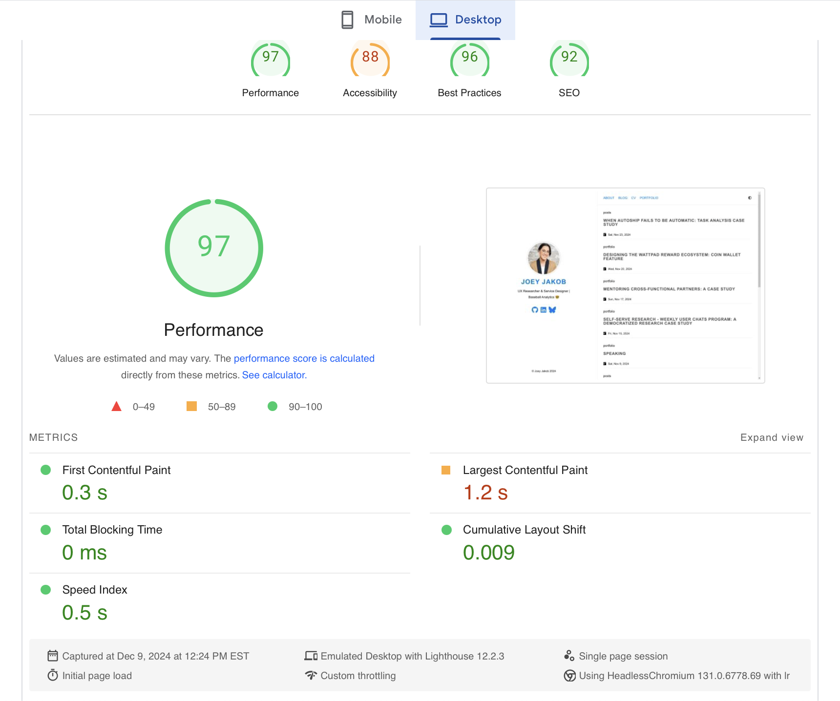
Figure 21. Speed test for my Feeds page, Desktop
The test I ran on December 9, 2024 showed this for my Feeds page, on Desktop:
- 97% Performance
- 88% Accessibility
- 96% Best Practices
- 92% SEO
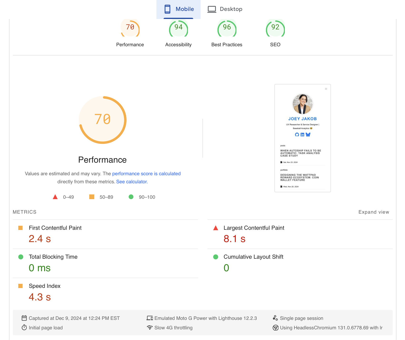
Figure 22. Speed test for my Feeds page, Mobile
The test I ran on December 9, 2024 showed this for my Feeds page, on Mobile:
- 70% Performance
- 94% Accessibility
- 96% Best Practices
- 92% SEO
Taken together, my Posts Feed on desktop comes short in Accessibility, at 88%, while Accessibility comes in at 94% in mobile. Conversely, my Posts Feed on mobile comes short in Performance, at 88%, while Performance comes in at 97% in desktop. (As a quick contrast, when I ran my Portfolio page, Accessibility for both mobile and desktop came in at 96% and 90%, respectively, while Performance resulted in 72% and 79%, respectively). What accounts for this difference is a classic issue facing many digital products: testing both on desktop (Windows, Mac, even Linux) and mobile (iOS and Android) are essential. Why is this the case? They each have different requirements, and consequently, each have different aspects and elements in the code used to build the product. Chiefly, these issues are seen below:
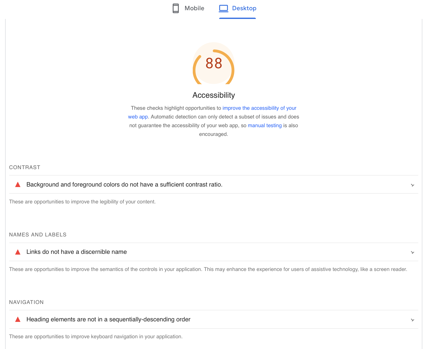
Figure 23. Accessibility problems, on Desktop
Detailed above are the issues to be further addressed to improve accessibility on desktop:
-
Background and foreground colours do not have sufficient contrast ratio (they do, however, in dark mode, which can be toggled on/off in the upper right corner; if your system’s default is dark mode, my site automatically opens that way)
-
Links require more discernible name (for assistive tech like screen readers)
-
Heading elements are not in sequentially descending order (but they are in Mobile, or if the browser window is made smaller on desktop)
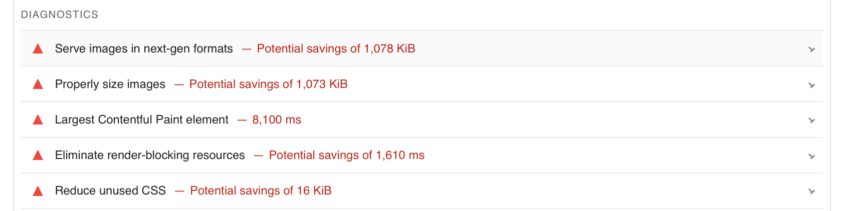
Figure 24. Performance problems, on Mobile
Detailed above are the issues to be further addressed to improve performance on mobile:
-
Image format and size update = kilobytes saved, and site will load faster
-
Render delay with my profile picture loading (“largest contentful paint element”) = save 8,000 milliseconds
-
Render-blocking occurs = critical JavaScript and CSS adjustments to defer all non-critical
-
Reduce unused CSS = defer unused CSS to decrease bytes consumed by network activity
These are being addressed with my next site update! But I had been running these tests in beta builds, attempting to circumvent too large of problems for the v1 launch here.
Deploy
Commanding Github to Deploy my Site (Step 9)
Okay, time to make the site go live! Here’s the process I go through every time I make a change to my site. Yes, every single time. If you make changes in Visual Studio Code and fail to do the following actions, the updates will not be visible on your site; the changes will instead sit in limbo, draft form, until you complete the process.
Open your computer’s Terminal. Here, you begin by changing the content directory
cd joey-xyz
so that it maps to your site.
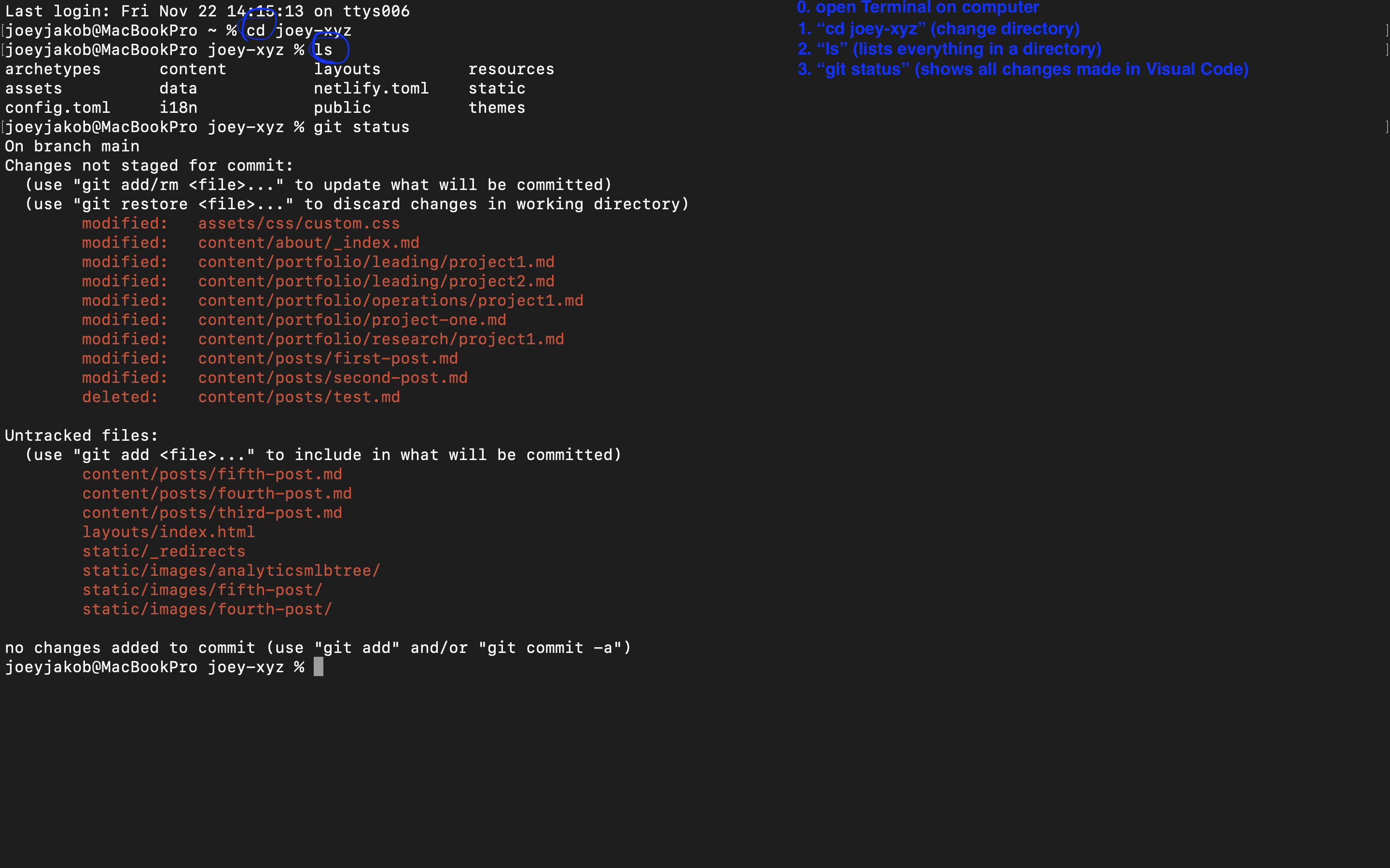
Figure 25. Terminal → change directory → list contents → git status
Once in the proper directory, you ask Terminal to:
ls
which lists all contents in your website’s directory. A good custom to have, because it reinforces that you’re in the right place (whereas if you asked your device’s Terminal to list its own contents, because you hadn’t previously changed the directory, you’d find listed your Applications etc.). Following this up with the command:
git status
will show you all the changes you made in your Visual Studio Code, the things you’re looking to deploy.
Now for the juicy part: adding the contents for deployment. Type the command:
git add .
No, that’s not a typo – you’re meant to place a space
[space]
between the word
add
and the
.[period]
Remember how I said before that nothing is an accident in programming language, and that the smallest failed detail can break your best intentions? This space commands the listing of all the new changes you’d like to add to your site. Next, you’ll once again command:
git status
to see this change list:
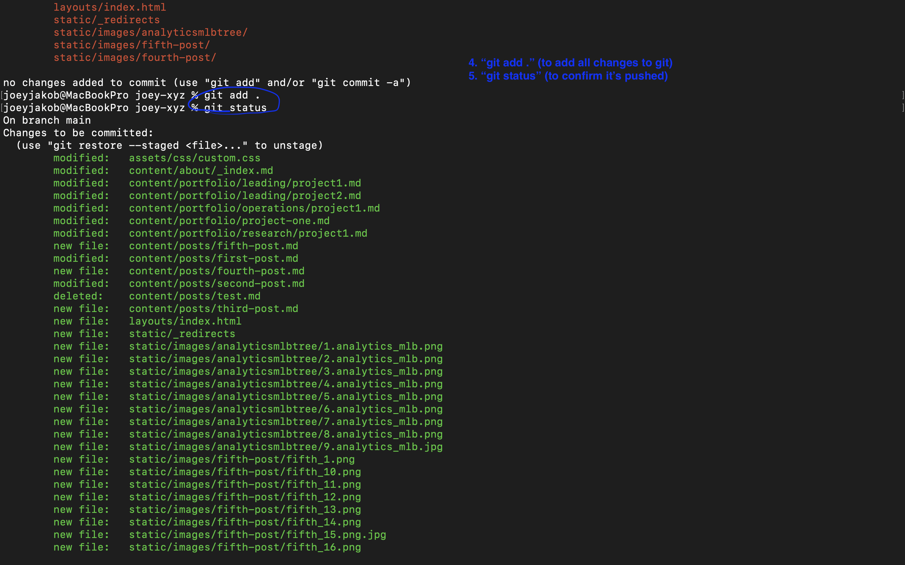
Figure 26. Adding the list of changes you made to your git deployment
From these listed changes you’re looking to push, you’ll next formally “commit” them:
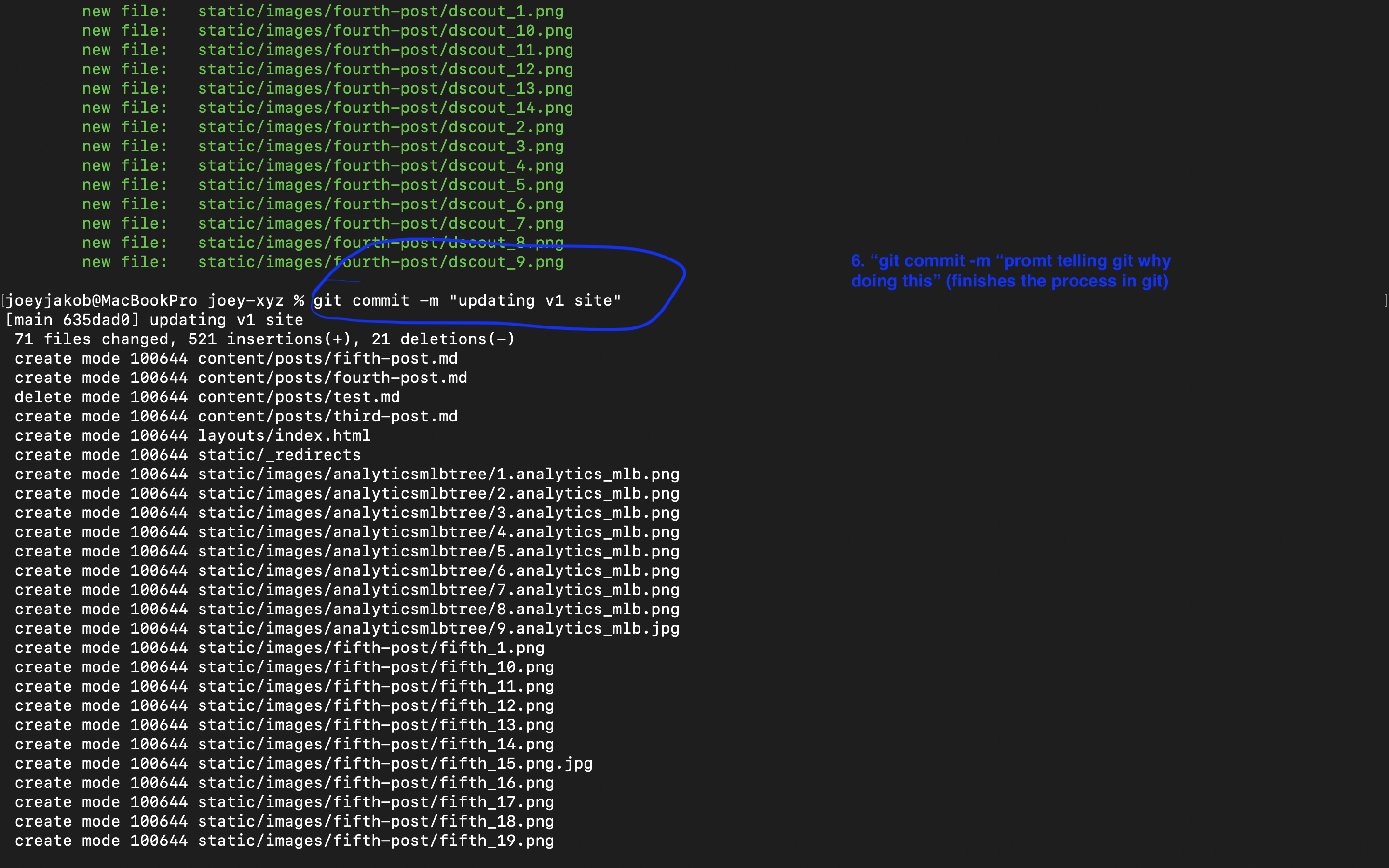
Figure 27. Git commit, with a prompt suggesting what these changes encompass
Your next command reads “git commit -m” followed by a prompt telling git why you’re doing this. For the curious, the “-m” allows you to add a commit message directly from the command line (Without “-m” git would open your default text editor to write the message). In this case, I typed:
git commit -m “updating v1 site”
You might wonder why such a prompt is important, I did. In this case it’s less relevant, if you’re the only one tending to your site. But imagine you’re at a big company and you’re one of dozens or hundreds deploying changes. How are we to track who, as well as why, these changes are made? This detailed prompt makes visibility and tracking easier, and we call the prompt you write, detailing the why, a “change log.”
The final command for your Terminal:
git push origin main
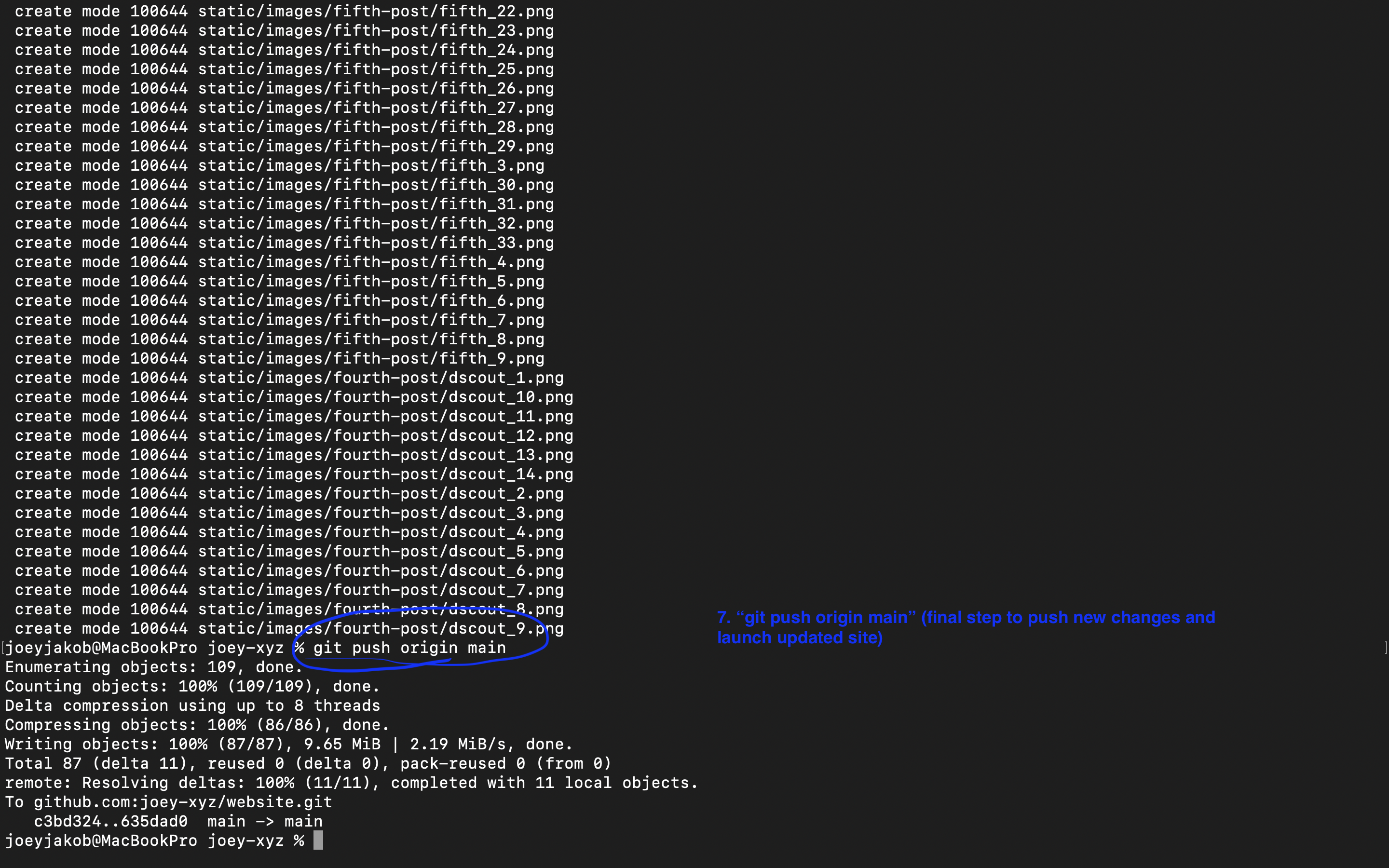
Figure 28. To push new changes to Git and to launch your updated site
This final step pushes the new changes and launches your updated site, which you’ll be able to see once the changes are loaded to git, then populated in Netlify, connecting to your domain.
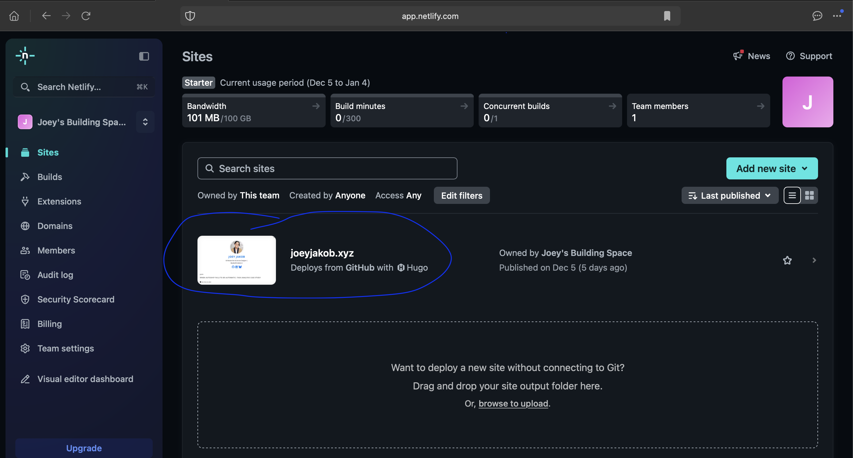
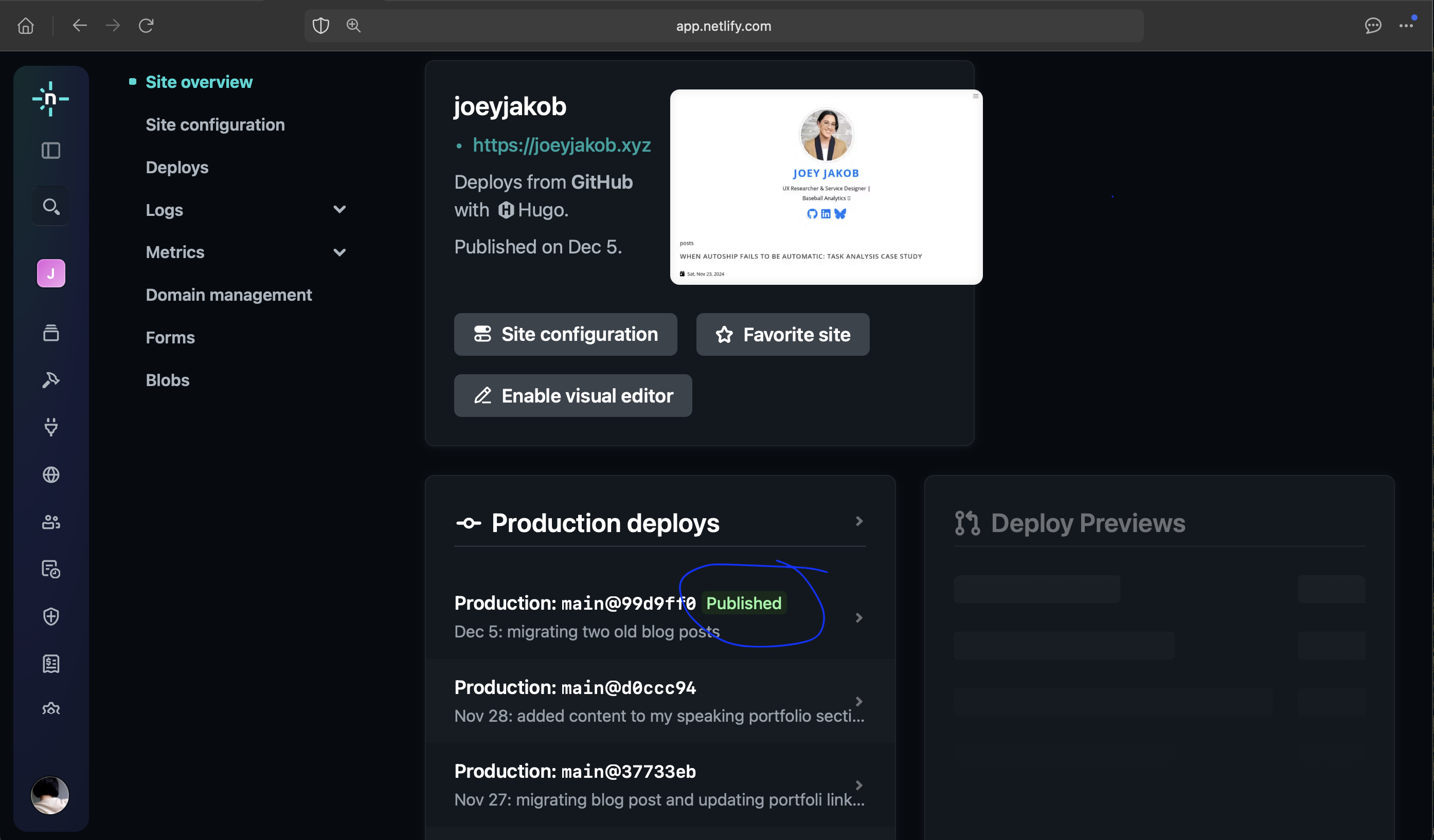
Figure 29 & 30. Visit launch status in Netlify; click site to verify Published
In Netlify, you can see in real time your Production Deploys fully Publish your changes. Also under the Production Deploys are every update you’ve made, along with the prompt you fed for your change log.
And there you have it: a website, from concept, to build, to launch. To recap, I toured you through my process in the following, steps 6-9 listed at the outset:
-
Sync the Github to the theme with your computer’s Terminal
-
Use a code editor like Visual Studio Code (for building and debugging) to migrate content
-
Accessibility testing with PageSpeed Insights or other
-
Push to Github with your Terminal
Thanks for coming along my journey of learning basic programming to design and launch my own site!